
Guests fall in love with your trees first—but they book, repost and return because every cabin, glamping tent and way-finding sign feels stitched to the same canopy. Want your property to look like it grew straight out of the forest floor yet photograph like a boutique hotel? It starts with a palette that works as hard as you do.
Imagine emerald siding that resists two summers of UV, alpenglow pink chairs that shout “sunrise” on Instagram, and charcoal trims that stay legible under headlamps. Skip the generic beige; choose tones that turn “just another campground” into a signature destination.
Ready to see which greens, neutrals and twilight accents can raise rates, cut maintenance headaches and keep guests oriented—even after dark? Keep reading; the forest is about to hand you its color playbook.
Key Takeaways
• First thing guests notice: matching colors make cabins feel special and raise bookings
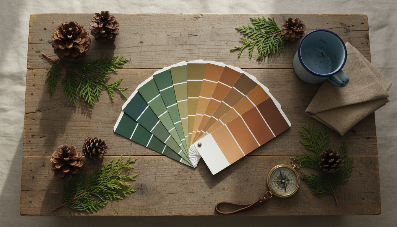
• Use forest tones for 70 % of big surfaces—moss, olive, charcoal, sandy taupe
• Add 20 % warm accents—terracotta doors, rust planters, alpenglow pink pillows
• Keep 10 % high-contrast trim—volcanic black or deep navy for signs and edges
• Same colors online and on site build trust and help guests pay premium rates
• Choose UV-safe paints and solution-dyed fabrics so shades stay bright for years
• Label utilities by color (slate blue water, khaki gray-water, burgundy electric) for quick work
• Test paint boards at noon, dusk, and night to be sure colors guide guests after dark
• Regular care list: spring power-wash, monthly wipe-downs, re-oil decks every 2 years
• Store HEX/RGB codes in one file so staff and vendors always match the exact hue.
Why Color Strategy Wins Bookings
Color is the first brand touchpoint a guest notices, long before customer service or amenity lists kick in. A cohesive palette threads its way from online hero images to the welcome center siding and the linen on glamping beds, creating subconscious trust that nudges browsers toward the “Book Now” button. When every physical element echoes digital marketing, guests feel confident they’ve landed in the right place and are willing to pay a premium for that certainty.
Competition for those eyeballs is intensifying. Industry analysts project hundreds of new safari tents, tiny homes and luxury cabins entering U.S. parks from 2024 to 2026, amplifying the need for memorable visuals RV Business report. A deliberate color strategy makes your property recognizable in a single thumb-scroll, keeps reviews consistent, and reduces the expensive churn of last-minute rebrands.
2025 Forest-Forward Color Trends
Designers are doubling down on nature-inspired minimalism for 2025, pulling directly from the forest floor. Deep emerald, moss and olive greens are the new neutrals, balanced by sandy taupe, terracotta and volcanic charcoal that feel grounded whether applied to upholstery or cabin exteriors IDP Designs. The restrained palette calms overstimulated travelers and blends seamlessly with surrounding tree canopies.
Alongside those greens, biophilic designers champion an alpenglow spectrum—soft pinks, ambers, dusky purples and smoky grey-blues—that mirrors sunrise and twilight light shifts The Collective Design. When a porch swing cushion glows the same shade as the ridge line at dawn, guests instinctively reach for a camera and, more importantly, the share button. Those organic gradients also provide flexible accent options that can be swapped seasonally without repainting large surfaces.
Build Your Three-Tier Core Palette
A repeatable system prevents color creep as staff repaint or new cabins roll in. Start with base hues—about 70 % of visible surfaces—such as moss, olive, forest green, charcoal and sandy taupe. These shades form the canvas for walls, roofing and major fences, disappearing into the landscape without looking dull. Accents, roughly 20 %, inject life: terracotta doors, rust planter rims, ochre deck chairs and limited pops of alpenglow pink on pillows or umbrella trims.
Reserve the final 10 % for contrast work that aids both branding and readability. Volcanic black or deep navy framing around windows, hardware and signage creates crisp edges and meets the 70 % lightness contrast ratio many accessibility guidelines recommend. A small callout in your operations manual with HEX and RGB values ensures every vendor and seasonal team member pulls the exact shade instead of a close guess.
Texture, Materials, and Mood
Color alone can’t carry the forest narrative; texture seals the story. Reclaimed wood siding, rough-cut stone veneer and woven jute rugs absorb and reflect base hues in organic ways, making mossy paint feel even more alive. Matte black or weathered brass fixtures pair naturally with volcanic trim, reinforcing the sense of handcrafted durability guests expect from an outdoor escape.
Maintenance matters as much as aesthetics. Penetrating oil-based stains on decking soak into wood fibers, shed water better than film-forming products and allow quick spot touch-ups—crucial when weekend turnover is tight and full sanding isn’t realistic. Choosing solution-dyed acrylic fabrics for cushions keeps alpenglow pinks and sage greens vibrant despite rain, pollen and campfire smoke, cutting replacement costs while preserving Instagram-ready visuals.
Zone-by-Zone Application Guide
Cabins and tiny homes come first in photo galleries, so anchor them in sage walls paired with soft stone trim. Cabin number plaques in volcanic black, finished with retro-reflective white lettering, remain readable from golf carts at night while looking sleek during the day. Safari tents benefit from sandy canvas exteriors accented by rust tie-backs and charcoal deck railings; the trio echoes surrounding soil and bark, yet photographs like a lifestyle magazine spread.
Common buildings deserve equal care. Neutral bark-brown exteriors transition gracefully from lush summer greens to snowy winter scenes, while doorframes painted one shade lighter act as intuitive beacons after dusk without resorting to harsh floodlights. Way-finding signs across property lines should use deep navy backgrounds, white sans-serif fonts and a matte finish to prevent glare. Adding discreet glow-in-the-dark stair strips preserves stargazing ambiance and meets safety codes.
Operational areas often dictate guest reviews more than owners assume. A muted utility palette—slate blue for potable-water hookups, dark khaki for gray-water and deep burgundy for electrical—lets maintenance crews locate connections fast without breaking immersion. Painting staff-only doors two shades darker than surrounding walls helps them recede from guest photos while still remaining obvious to employees hurrying on a turn-day.
Make Color Last: Durability and Maintenance
Outdoor palettes face brutal conditions—UV, rain, pollen, soot—so product selection is non-negotiable. Prioritize exterior paints rated in the top tier for sun-exposure hours, especially on south- and west-facing walls that bake each afternoon. UV-stable coatings keep emerald siding and terracotta shutters from chalking out after a single high season, sparing budget for guest amenities instead of repaint crews.
Establish a seasonal color-care checklist every employee can follow. Spring power-washing removes mildew before it stains, monthly soap-and-water wipes on metal trims preserve charcoal sheens, and re-oiling cedar accents every two years maintains that deep, photogenic warmth. When the palette survives, so does your brand equity.
Seeing After Sunset: Low-Light Testing
Colors morph when the sun drops behind the ridge, so always create two-foot test boards and inspect them under path lighting, camp lanterns and moonlight. Sage that feels lush at noon can flatten into gray after dark, while a deep olive may surprisingly hold its depth. Adjust formulas or gloss levels before signing the final purchase order; reordering mid-project costs more than an extra sample quart.
Signage deserves special scrutiny. Pair any dark backdrop—navy or volcanic black—with four-inch minimum white icons or lettering. Retro-reflective vinyl elevates readability for golf carts and headlamps, lowering the risk of lost, frustrated guests. Solar-charged edging on docks or stair landings delivers subtle safety cues that keep the night sky pristine for telescope enthusiasts.
Adapt for Seasons and Regions
Forest palettes must survive more than sunlight; they battle snowdrifts, red clay dust and desert glare depending on your latitude. In snowy climates, avoid high-percentage white on posts or bollards because they vanish into the landscape and create trip hazards. Warm cedar stains or dark bronze powder coats stay visible and hide salt spray better.
Southern heat demands its own tweaks. Mid-tone olives and rusts absorb less radiant energy than charcoal, keeping cabin handrails cool to the touch and easing HVAC loads on tiny homes. Trend-forward décor like ochre planters or alpenglow throw blankets should remain movable, letting you refresh marketing photos each season without repainting an entire façade.
Implementation Roadmap
Begin with a guided nature walk—phone in hand—to photograph local moss, bark and twilight skies. Free color-picker apps convert that imagery into HEX values you can drop directly into Canva or Adobe palettes. Next, order paint and fabric samples and test them onsite at noon, dusk and night, noting any unexpected shifts.
Once satisfied, finalize ADA contrast ratios and utility coding guidelines in a cloud document accessible to contractors and seasonal staff. Roll the palette into your website headers, OTA photos, printed maps and even email templates so brand unity follows guests from booking to checkout. The final step: schedule annual palette reviews alongside budget planning, ensuring color integrity remains a line item, not an afterthought.
Fast-Reference Checklist
Even the most thoughtful palette falls apart if on-site teams can’t recall the details during crunch time. A concise, living checklist keeps every maintenance tech, contractor and seasonal hire on the same page, shrinking the margin for error when materials are ordered or touch-ups are made. Framing the list with context ensures it feels like a proven system rather than yet another memo tacked to a corkboard.
Use the quick-hits below as a ready reference during morning rounds, purchase-order approvals and design meetings. Print and laminate a copy for supply closets, embed it in your project-management software, and revisit it each spring so the recommendations evolve alongside your property. When the right color codes and maintenance intervals are always within arm’s reach, brand consistency becomes automatic.
• 70 % lightness contrast on all signage
• UV-rated paint codes stored in PMS and vendor files
• Oil-based stains on decking, re-oiled biennially
• Slate blue = water, khaki = gray-water, burgundy = electric
• Retro-reflective lettering on dark way-finding signs
• Glow-in-the-dark strips on stairs and dock edges
• Doorframes one shade lighter than walls for subtle night beacons
• Solution-dyed fabrics for cushions, awnings and umbrellas
• Movable décor holds trend colors, not permanent structures
• Staff-only doors two shades darker for discrete visibility
• Seasonal power-wash and wipe-down schedule posted in break room
• Sample boards viewed in full sun, dusk and under path lights
Your new palette can whisper “remote wilderness” in person and shout “book now” online—but only if every touchpoint syncs flawlessly. Insider Perks specializes in making that happen, translating the HEX codes you just chose into scroll-stopping ads, AI-driven guest messaging, and automated workflows that keep maintenance on schedule and cabins full. Want emerald siding headlining Instagram reels, signage colors populating dynamic OTA listings, and your brand running on autopilot while you focus on fireside stories? Let’s paint that future together. Explore Insider Perks today and watch your forest hues work harder than ever for every reservation, review and return visit.
Frequently Asked Questions
Q: How many colors should my campground palette include to stay cohesive without feeling flat?
A: Most operators succeed with a three-tier system of roughly eight to ten total hues: five or six base neutrals and greens that cover 70 % of surfaces, two or three accent shades for 20 %, and one or two high-contrast tones for the remaining 10 % devoted to trim and signage; this ratio keeps visual unity while still giving you enough variety to highlight architecture, way-finding and seasonal décor.
Q: We already have cabins painted in several different browns—can we transition to a forest-forward palette without closing units?
A: Yes; phase changes during routine maintenance cycles by first matching new trim and signage to your desired contrast color, then repainting high-visibility elements like doors and railings, and finally tackling full wall areas as they come due, so the evolution feels intentional to guests and never disrupts occupancy.
Q: How do I test that the colors I like will actually read well after dark?
A: Create two-foot sample boards in the exact paint or stain and place them in multiple zones, then inspect them at noon, dusk and under your typical path or porch lighting; if lettering, edges or textures blur at night, adjust the lightness value or add a retro-reflective layer before ordering gallons.
Q: Does investing in UV-rated paints and solution-dyed fabrics really save money long term?
A: While the upfront cost is 15–25 % higher, operators typically recoup that within two seasons through fewer repaint cycles, lower linen replacement, reduced labor hours and stronger guest photos that drive bookings, giving a measurable bump to RevPAR that inexpensive materials rarely deliver.
Q: What’s the simplest way to keep seasonal staff and outside contractors from using the wrong shade?
A: Store every approved HEX, RGB, PMS and vendor paint code in a shared cloud folder, print a quick-reference sheet for the maintenance shop, and require photos of color labels before purchase orders are signed, so no one relies on memory or “close enough” swatches.
Q: How often should I plan to refresh or tweak the palette once it’s in place?
A: Schedule an annual review during budget planning to confirm ADA contrast, inspect fading and decide if movable décor needs trend updates, but expect the core architectural palette to last seven to ten years with only spot touch-ups if you’ve used high-quality, UV-stable coatings.
Q: Will darker greens and charcoals make summer cabins hotter for guests?
A: Mid-tone olives, sages and rusts absorb far less radiant heat than true blacks, and even deep charcoals stay manageable when paired with proper roof insulation and shade trees, so guests won’t notice temperature differences while you still gain the dramatic, lodge-like aesthetic.
Q: How do I ensure my color choices meet ADA readability standards for signage?
A: Aim for a 70 % lightness contrast between background and lettering—tested with free online contrast checkers—and use sans-serif fonts at least four inches high with either retro-reflective vinyl or matte anti-glare coatings to keep signs legible in daylight, headlamps and golf-cart headlights.
Q: Can I use the same palette across cabins, RV sites and glamping tents without everything looking identical?
A: Absolutely; apply the base greens and neutrals consistently to anchor the brand, then vary the accent distribution—perhaps terracotta doors on cabins, rust tie-backs on tents and ochre furniture at RV patios—so each lodging type feels unique yet clearly part of one cohesive resort.
Q: What regional tweaks should I consider for a property in heavy-snow country?
A: Substitute high-visibility mid-tones like warm cedar or bronze for posts and bollards that would disappear under snow, ensure all trim colors contrast with white backdrops, and use matte anti-corrosion coatings that resist salt spray, so your palette stays vivid and functional through freeze-thaw cycles.
Q: Are there eco-friendly paint or stain options that still meet the durability specs you recommend?
A: Yes; several manufacturers offer low-VOC, water-based acrylics and plant-oil stains rated for 5,000-plus UV hours, so you can maintain air quality standards and earn sustainability certifications without sacrificing longevity or color richness.
Q: How quickly can I roll out a new palette if peak season is only three months away?
A: Prioritize high-impact, low-square-footage elements such as doors, trim, signage and outdoor furniture, which can usually be completed in two to three weeks with a small crew, then schedule larger wall and roof projects for shoulder season when occupancy dips and weather still allows exterior work.
Q: Will a cohesive color strategy really influence online booking behavior?
A: Properties that align on-site colors with digital imagery generate more consistent guest photos, higher review scores for atmosphere, and clearer brand recognition in OTA thumbnails, all of which translate into improved click-through rates and a measurable lift in bookings compared with visually inconsistent competitors.