
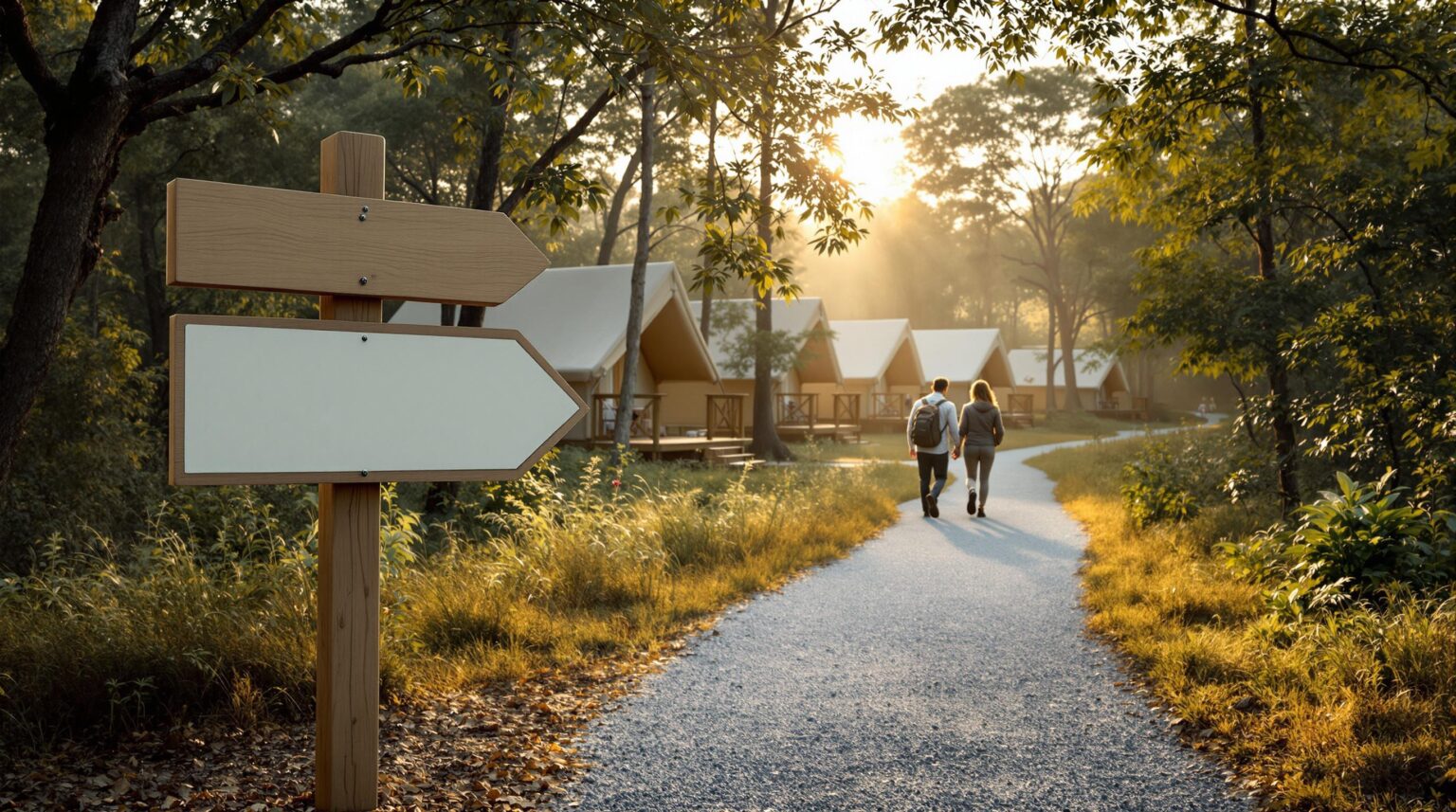
Guests love the thrill of the wild—until they’re wandering circles with a restless toddler at dusk. Every “Which way to the yurt?” steals minutes from staff, chips away at reviews, and silently drains ancillary sales you didn’t know you were missing.
Imagine if your signs appeared exactly where a guest’s feet—and doubts—naturally pause. Map the flow, place the cue, and confusion vanishes before it starts. The result? Smoother check-ins, happier campers, and more time for your team to upsell fire-wood bundles instead of giving directions.
Curious how to turn meandering footpaths into data-driven wayfinding that pays for itself? Step inside; the roadmap begins below.
Key Takeaways
Wayfinding can feel like a design project, but it is really an operations lever that touches revenue, staffing, guest satisfaction, and brand perception all at once. The bullets that follow distill the entire strategy into bite-sized wins you can apply as soon as your next check-in rush.
– Lost guests cost you time, reviews, and extra sales
– Walk the paths to spot where people pause or turn around
– Use simple sensors or QR codes to collect real traffic data
– Map the top trouble spots and give them first-priority signs
– Make signs big, bright, brand-colored, and easy for everyone to read—even at night or in a wheelchair
– Build signs from weather-proof stuff so they last and stay clean
– Add phone maps and on-site kiosks for step-by-step digital help
– Test the new system, tweak what’s wrong, and recheck every season
– One campground moved six signs and cut “Where am I?” calls by 40%, while rentals went up 18%
– Use the simple 30-day plan to start turning confusion into happy guests and higher revenue.
Walk the Site, Then Let Data Talk
Before you buy a single sign blank, lace up your boots. A daylight walk-through of every entrance, fork, and “pause point” shows where first-timer doubts spike. Note sightlines, grade changes, competing visuals, and nighttime shadows. The human eyeball will always catch subtleties an aerial drone misses, yet observation alone is only half the story.
Transform those impressions into hard numbers. For one peak week, mount $50 motion counters on main lanes and drop QR check-in stickers at key junctions. The counters reveal traffic volume and speed—vehicles crawling at 10 mph versus sandals shuffling at 3 mph—while QR timestamps mark where guests hesitate. Compare true “desire paths” to the routes you intended. Where the two diverge, the map bends in favor of guest instinct. Re-run a mini-study whenever you add a bathhouse or reroute carts; small layout tweaks create fresh decision points that demand fresh signage.
Plot Decision Points on a Master Map
Upload your counts into a satellite overlay and highlight junctions generating 80 percent of wayfinding questions. Those crimson dots become priority nodes: the welcome gate, the first fork, the parking-lot exit, and the amenity hubs where strollers, bikes, and golf carts mix. Number them, name them, and sketch a sign hierarchy—primary pylons at entries, secondary blades along paths, tertiary markers inside activity zones.
Now layer accessibility over the skeleton. Mark every grade-friendly or ramped route, then mirror the sign frequency of standard paths. Mount braille and tactile lettering between 48 and 60 inches so both seated and standing guests can read with ease. Use high-contrast palettes—think charcoal on sandstone or white on forest green—and 70-point sans-serif fonts that stay legible for aging eyes and color-blind visitors. If a route veers steeply downhill, post the alternative flat route at the same decision point so mobility-impaired guests never have to hunt for guidance.
Design Signs Guests Actually See and Share
A sign’s job is twofold: get guests where they’re going and whisper your brand along the way. Uniform typography, color, and iconography forge instant recognition, a principle proven across resorts by resort signage design research. Carry signature hues into post caps or routed edges, and consider local materials—river-rock bases or reclaimed cedar—to craft photo-worthy spots that beg for Instagram tags.
Durability and visibility are non-negotiable. On vehicular lanes, specify reflective sheeting and four-inch arrows so headlights do the heavy lifting after dark. Footpaths benefit from eye-level blades lit with low-glare LEDs aimed downward to protect that dark-sky stargazing you advertise. Choose weather-matched substrates: powder-coated aluminum in humid Gulf air, HDPE in salt-spray coasts, and cedar in freeze-thaw mountain regions. Protect graphics with UV-stable inks and anti-graffiti laminates; a quick wipe on checkout morning beats a two-week reprint delay.
Layer Digital Wayfinding on Top of Wood and Metal
Static panels build confidence; digital tools extend it to the palm of every hand. Embed an interactive map via a branded web link or resort app, letting guests tap for step-by-step navigation, amenity pop-ups, and real-time push alerts about tonight’s s’mores social. Outdoor hospitality operators report significant reductions in “Where am I?” calls after adopting mobile navigation platforms like those detailed in navigation systems.
For larger or multi-level properties, customize layers by season—haunted hayride routes in fall, snowshoe trails in winter—or by accessibility preferences. Platforms such as resort-hotel maps let you pre-filter wheelchair-friendly paths, ensuring universal access without screen clutter. Kiosks at lobbies or trailheads, equipped with touch or voice menus, offer instant answers for device-free guests and free staff to focus on higher-value interactions like excursion upsells.
Test, Adjust, Repeat—Maintenance Is Part of the Map
Launch your new system at the five busiest nodes and track impact for 30 days. Compare front-desk call logs, observe whether guests still stall at junctions, and watch upsell clicks inside the app. A soft roll-out uncovers blind spots—maybe a spotlight glare hides the welcome arrow, or an arrow’s wording feels too formal for your boho audience. Tweak copy and angles before scaling resort-wide.
Quarterly micro-studies keep data fresh. Mount counters for a weekend, review kiosk analytics, and scroll guest-survey comments. If a new desire path appears, reposition rather than add clutter. Audit illumination weekly—one burned-out LED at a three-way split can undermine months of planning. When local ordinances update fire-pit setbacks or pool rules, swap in fresh inserts instead of reprinting entire panels; modularity saves both money and landfill space.
A Quick Success Story: Six Signs, One Season, Big Results
Riverbend Glamping, a 75-site riverside retreat, installed motion counters at seven junctions last May. Data showed 62 percent of first-night confusion clustered around just two forks near premium safari tents. The team shifted six signs, added two digital kiosks, and embedded QR codes for kayak rentals on secondary panels. By Labor Day, front-desk wayfinding calls dropped 40 percent, while kayak bookings jumped 18 percent—enough incremental revenue to cover the entire signage revamp in one peak season.
The lesson is simple: when routing maps meet real movement, every arrow and pixel starts pulling its weight. Guests stop guessing, staff stop hand-holding, and revenue lines nudge north. Intentional wayfinding is not an expense; it is a profit engine disguised as a directional arrow.
Your Next 30-Day Action Plan
A structured pilot keeps risk low and insight high. Treat the next month as a live A/B test: minimal spend, maximum learning. Start small, measure everything, and only then scale.
1. Schedule a sunrise walk-through with clipboard and phone camera; flag every spot a first-timer might hesitate.
2. Deploy motion counters or QR check-ins by Friday, and collect one full week of traffic data.
3. Draft a master map highlighting the ten decision points that matter most; color-code accessible routes.
4. Request quotes for modular base panels with slide-in inserts, high-contrast fonts, and reflective sheeting.
5. Trial a free digital map platform; upload points of interest, set up push alerts, and test screen-reader mode.
6. Put quarterly signage audits and ordinance reviews on your calendar; future you will say thanks.
When the 30 days end, gather your numbers and decide on phase two. If wayfinding calls and guest detours have already dropped, you’ll have proof of concept to unlock budget for a full-property rollout. Should the data show mixed results, use heat maps and guest feedback to fine-tune sign placement, adjust copy, or expand digital prompts before making permanent changes. By iterating quickly, you’ll avoid costly missteps and build a signage system that keeps paying dividends year after year.
Your paths are already whispering the story of every arrival—pair the right signs with the right data and that story turns into five-star reviews, leaner labor costs, and a steady hum of ancillary sales. If you’re ready to swap guesswork for heat maps and wooden posts for revenue posts, let Insider Perks walk the route with you. Our team blends marketing strategy, AI-powered analytics, and automated guest messaging to transform foot-traffic insights into resort-wide ROI. Schedule a quick strategy session today, and we’ll show you exactly where the next arrow—and your next profit center—should go.
Frequently Asked Questions
Q: How much does it typically cost to gather movement data and overhaul signage at a midsize property?
A: For a 100-site resort, expect around $500–$1,200 for temporary motion counters and QR decals, $3,000–$6,000 for a professionally designed sign family of 10–15 panels, and $1,000–$2,000 for installation; most operators recoup the outlay within one peak season through reduced staff time and incremental sales like rentals or bundles.
Q: What if my guests aren’t tech-savvy and won’t scan QR codes or use an app?
A: Physical signs remain the backbone of wayfinding; the digital layer is optional icing that helps those who want turn-by-turn guidance, so even if only 40 percent of visitors adopt the app, everyone still benefits from clearer on-site arrows and maps.
Q: How often should I re-run traffic studies or update my maps?
A: Re-measure movement after any layout change—new bathhouse, relocated trash enclosure, added glamping pods—or at least once a year before high season so your signage keeps pace with evolving “desire paths.”
Q: Do I need a professional designer, or can my maintenance crew fabricate signs in-house?
A: In-house teams can install posts and panels, but a designer versed in resort wayfinding ensures consistent typography, hierarchy, and ADA compliance, which prevents costly reprints and delivers a polished guest experience.
Q: How do I make sure my new signs meet ADA and accessibility standards?
A: Mount primary messages between 48″ and 60″, use high-contrast colors, include braille or tactile lettering where directions change, and duplicate every steep or stair route with a clearly signed accessible alternative.
Q: What substrates and finishes hold up best in extreme weather?
A: Powder-coated aluminum paired with UV-stable inks handles humidity and rain, HDPE resists salt spray on coasts, and cedar or redwood treated with marine-grade varnish survives freeze-thaw cycles and looks natural in wooded settings.
Q: How can I quantify success once new signage is installed?
A: Track front-desk or radio calls for directions, measure app engagement, review guest survey comments, and compare ancillary revenue from activities or retail; a 30–60 day dip in wayfinding queries coupled with a bump in upsells signals the system is working.
Q: Won’t more signs create visual clutter and spoil the natural vibe guests crave?
A: A hierarchy limits panels to true decision points, uses consistent materials that blend with the landscape, and replaces scattered ad-hoc arrows with fewer, clearer markers, so the end result actually feels cleaner and calmer.
Q: How do I navigate local zoning rules or permits for new signage?
A: Check municipal codes for size, height, illumination, and setback restrictions, then submit scaled drawings with material specs; many jurisdictions fast-track wayfinding signs that are informational rather than advertising.
Q: Are QR codes still effective, or should I jump straight to NFC or Bluetooth beacons?
A: QR codes remain cheap, universal, and maintenance-free across both iOS and Android, making them a sensible first step; you can layer NFC tags or beacons later if analytics show strong guest adoption of mobile tools.
Q: How do I prevent vandalism or fading, especially in high-traffic areas like bathhouses?
A: Specify anti-graffiti laminate so permanent markers wipe off with solvent and use UV-cured inks rated for five-plus years, while placing cameras or motion-activated lights near vulnerable nodes discourages mischief.
Q: What’s the quickest way to pilot a new wayfinding approach without a full property overhaul?
A: Identify the two or three junctions that generate the most “Where am I?” questions, deploy temporary stake signs or sandwich boards with the proposed messaging, collect guest feedback for a month, then refine and scale up.